LÉKUÉ
rebranding proposal project for Lékué (2023)
![]()
![]()
![]()
![]()
![]()
![]()
![]()
![]()
![]()
![]()
![]()
![]()


Lékué is a leading brand in the manufacturing of innovative kitchen products, committed to simplicity, naturalness, and health. They focus on creating silicone and other products that make cooking easier, healthier, and more fun.
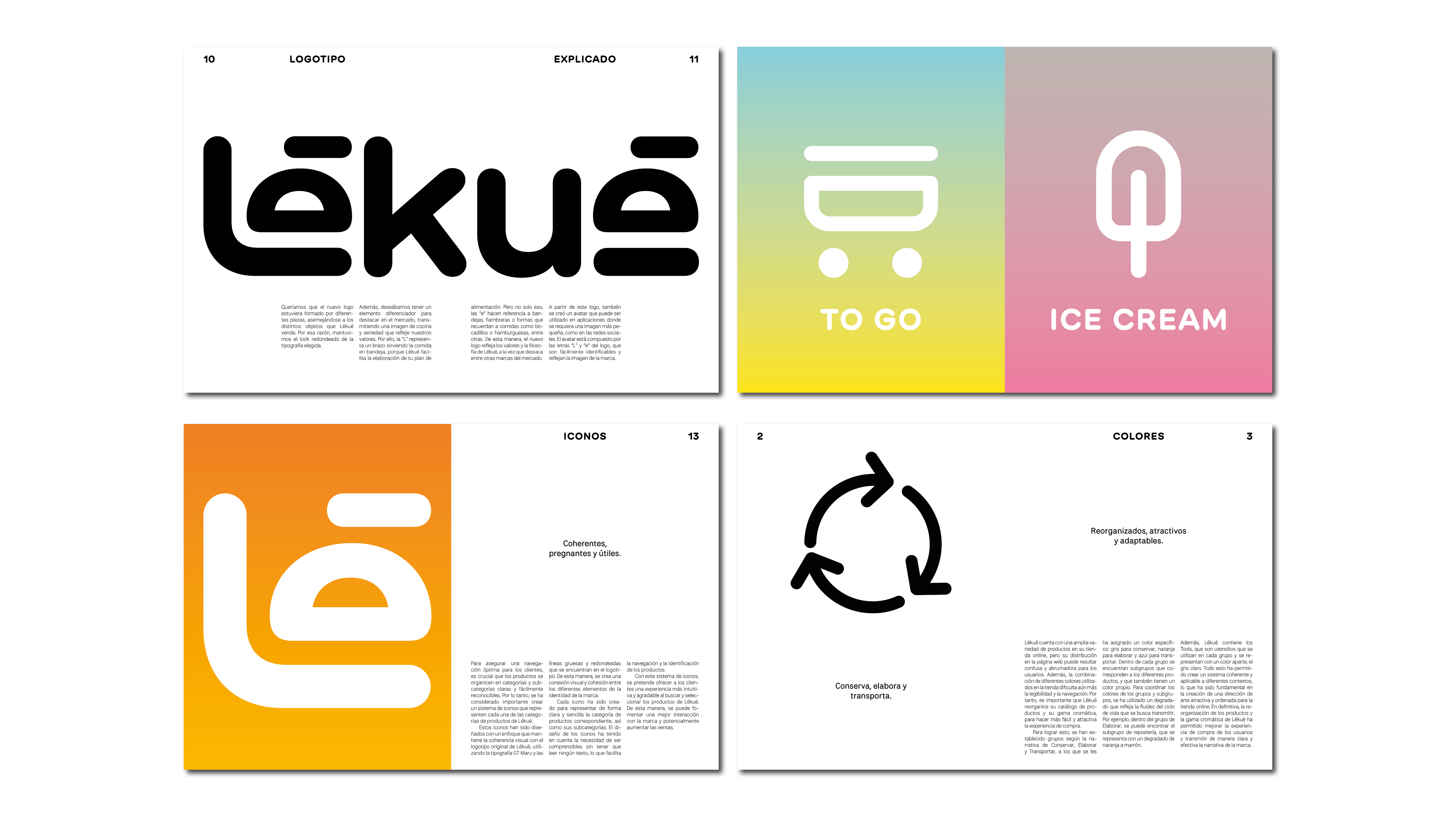
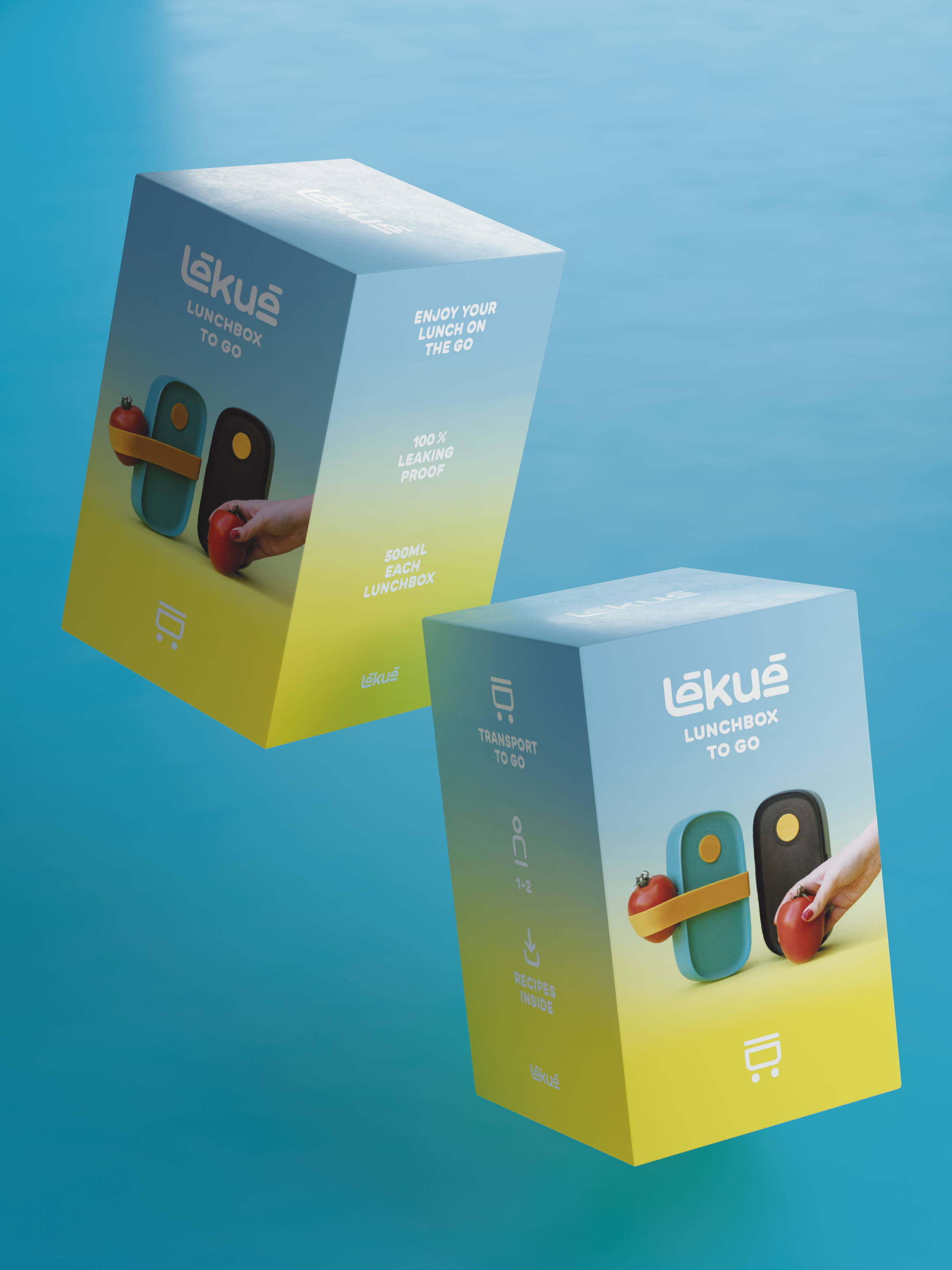
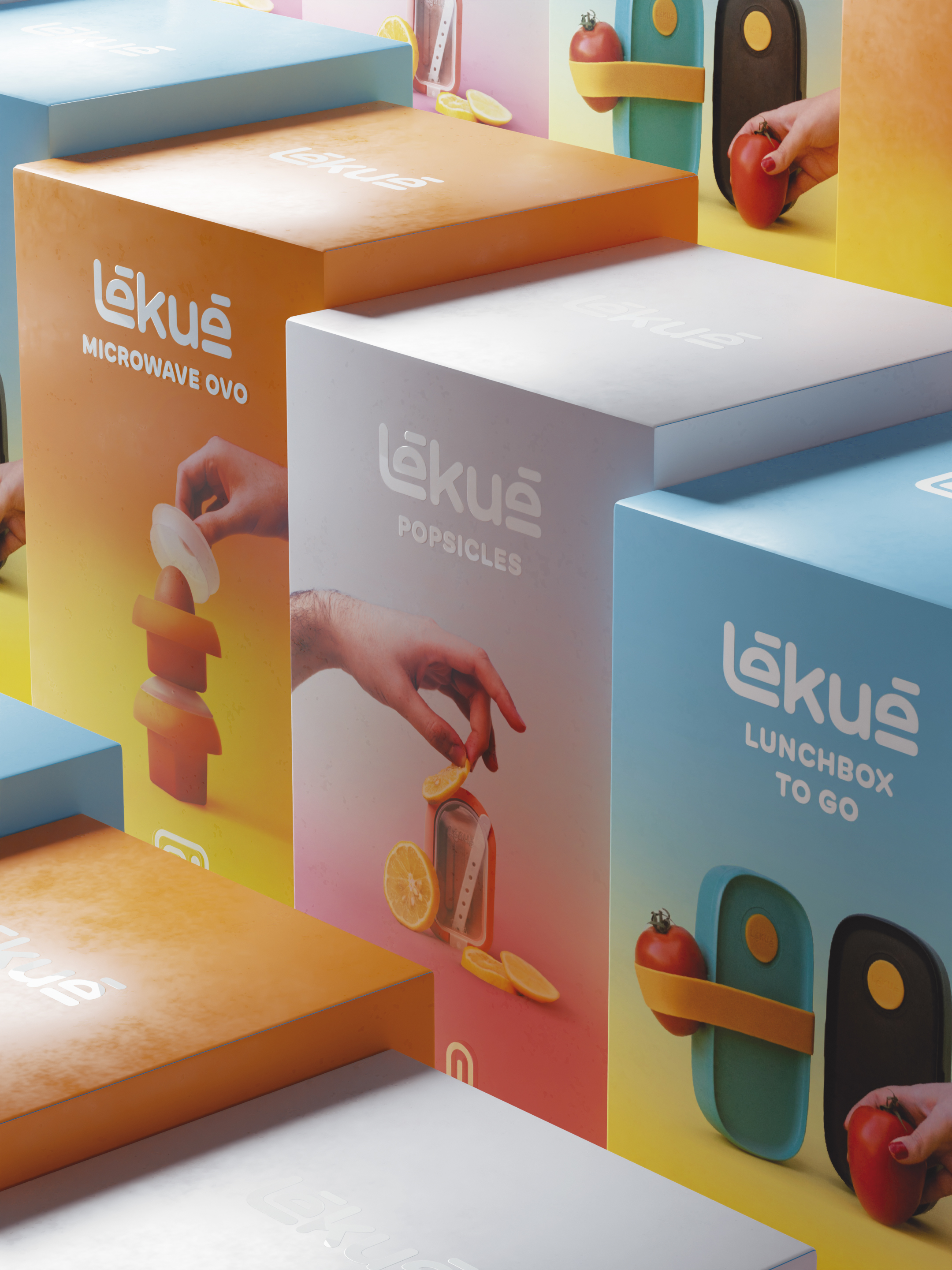
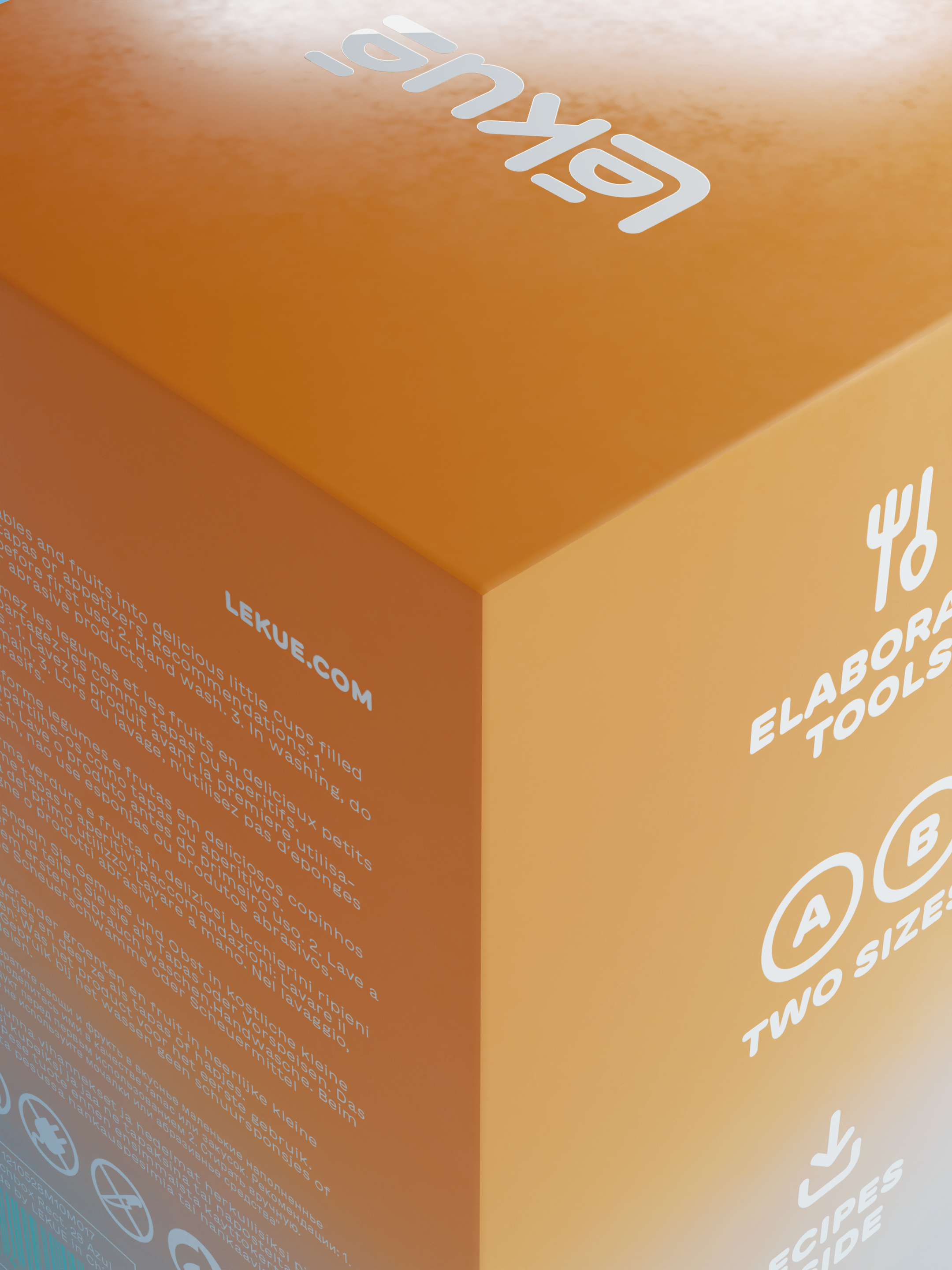
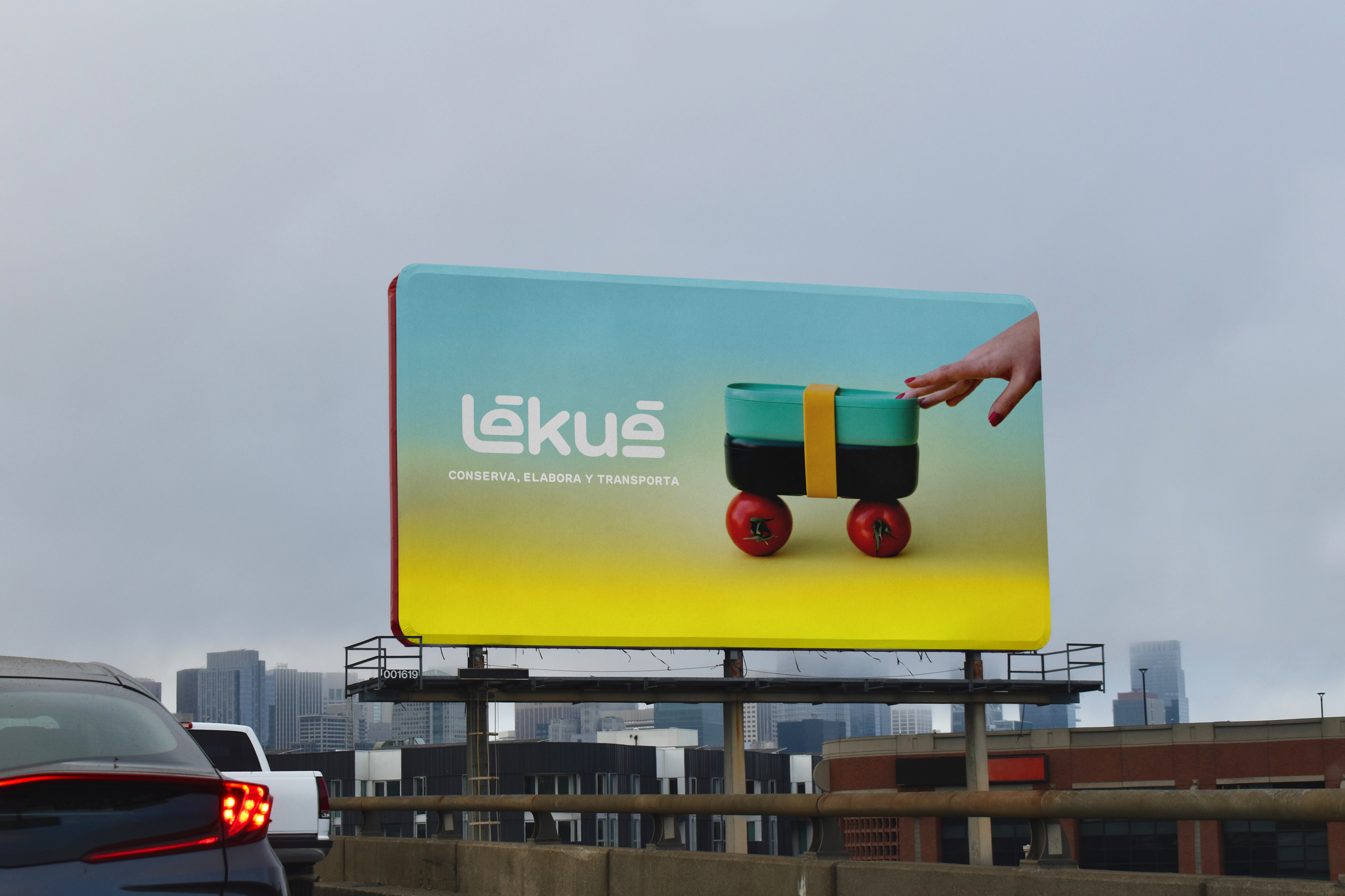
The redesign we proposed consisted of a complete brand overhaul. The new logo features an "L" representing an arm serving food on a tray, and the "e's" resembling trays, lunchboxes, or food shapes like sandwiches or burgers. Additionally, its round shape, also reflected in the chosen typography, recalls the silicone kitchen products they sell. Following the logo's aesthetic, we also designed a series of icons that define the different product lines, giving much more strength to the Lékué universe.
The redesign we proposed consisted of a complete brand overhaul. The new logo features an "L" representing an arm serving food on a tray, and the "e's" resembling trays, lunchboxes, or food shapes like sandwiches or burgers. Additionally, its round shape, also reflected in the chosen typography, recalls the silicone kitchen products they sell. Following the logo's aesthetic, we also designed a series of icons that define the different product lines, giving much more strength to the Lékué universe.
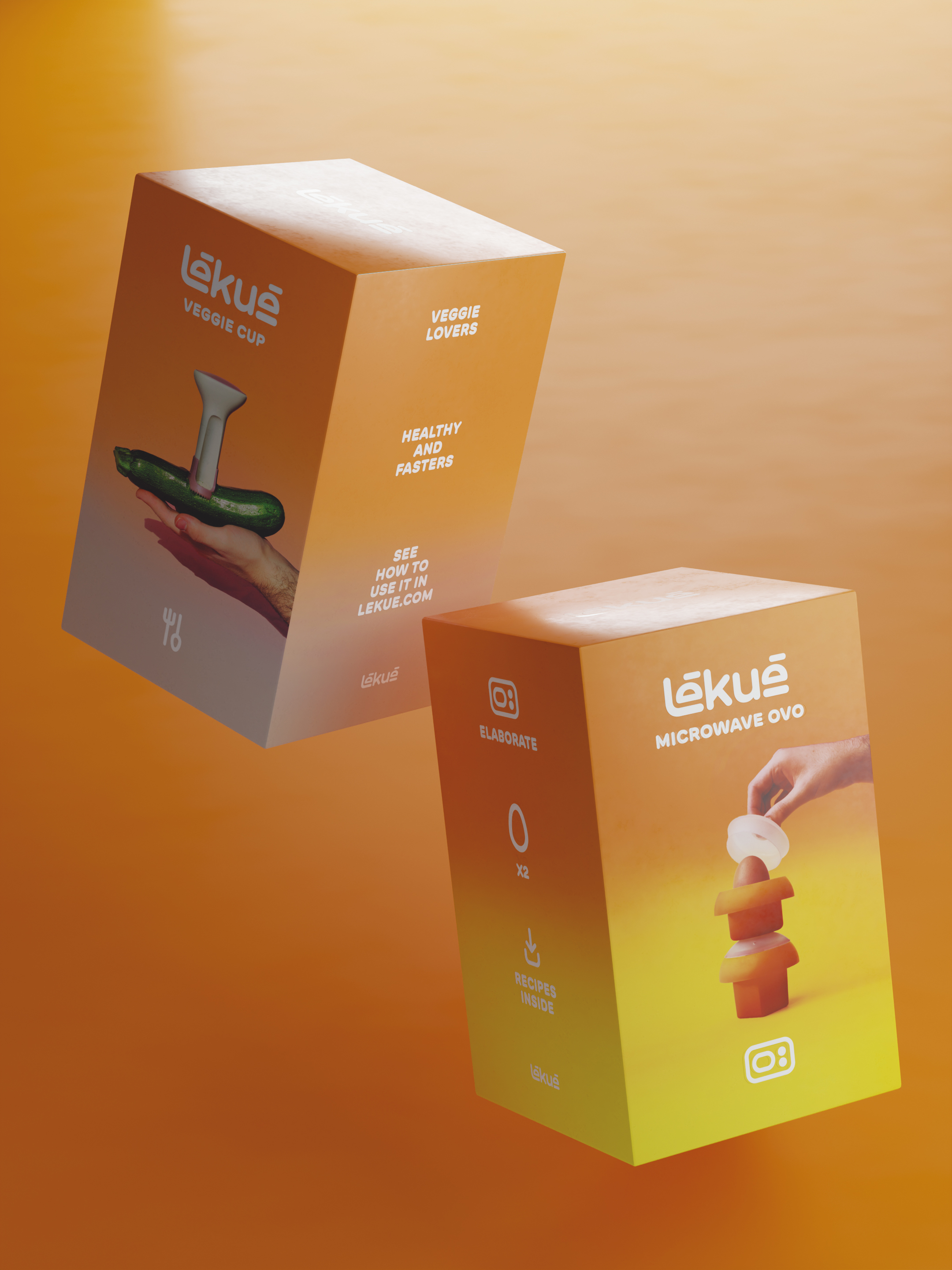
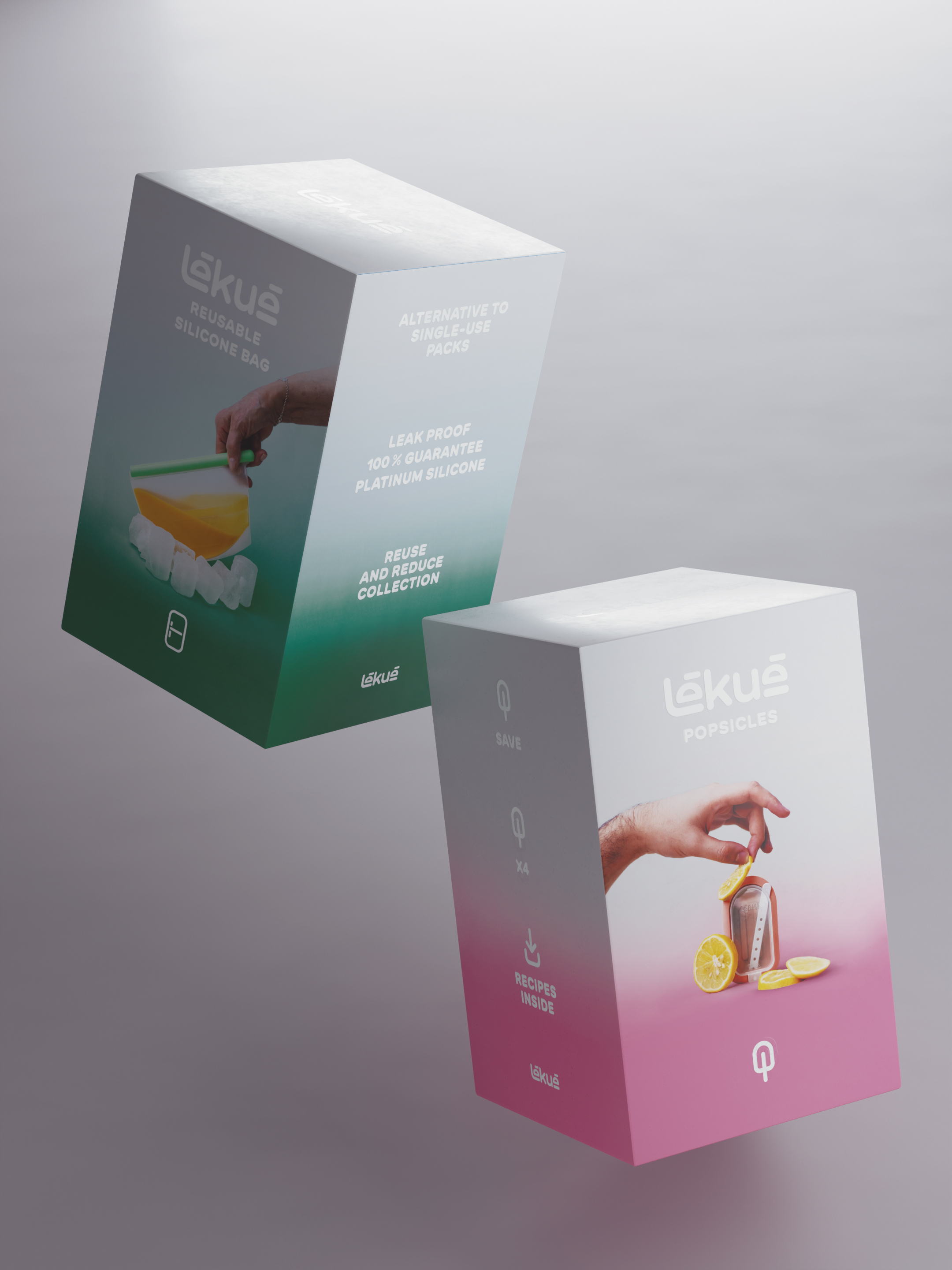
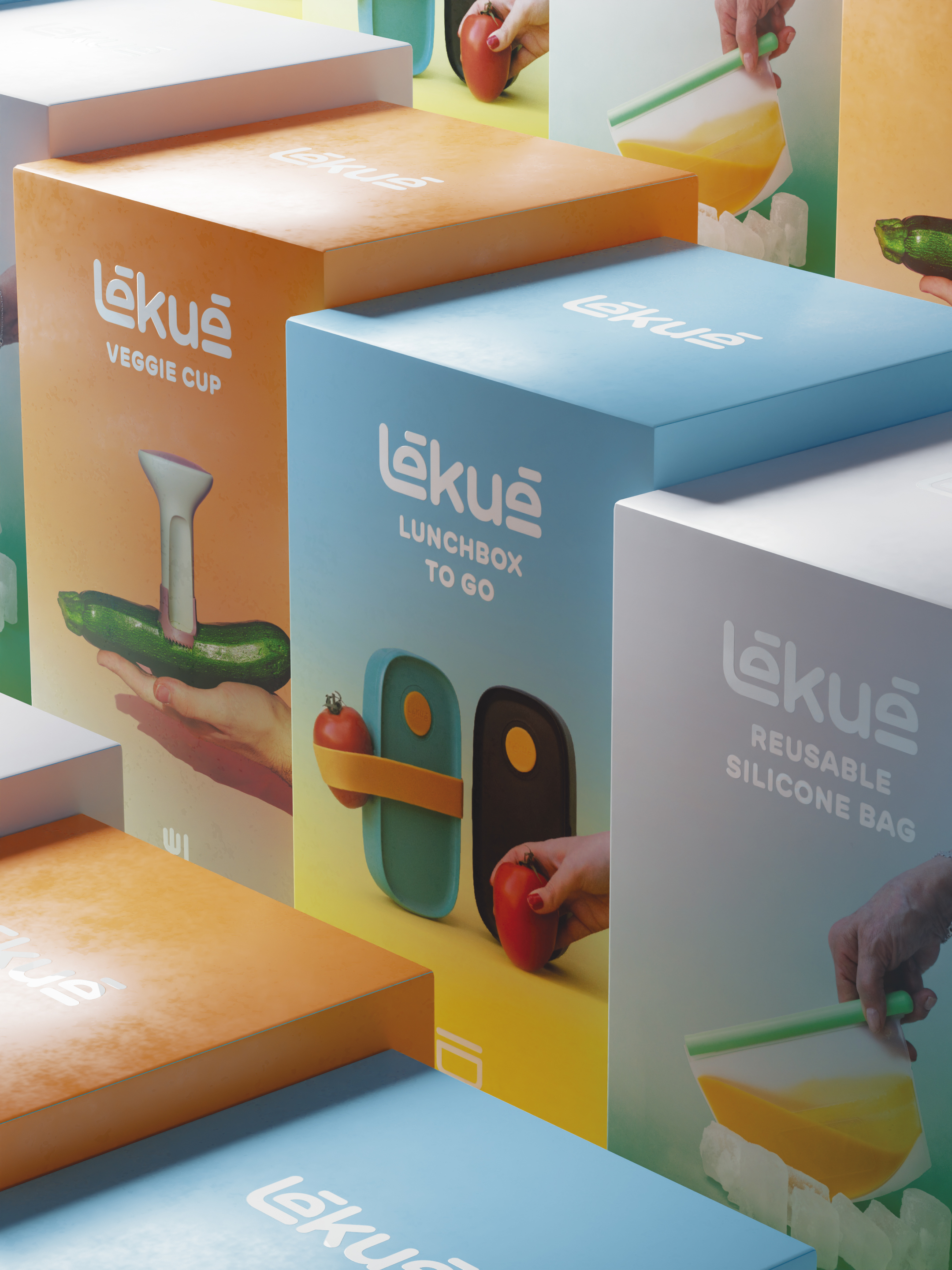
We also presented a unique and eye-catching art direction in the industry, combining a more conceptual style in the product photographs and a gradient of color. The gradient color defines the product line so that it is immediately recognizable, following the three main colors representing the brand's three pillar verbs: Preserve (grey), Prepare (orange), and Transport (blue).
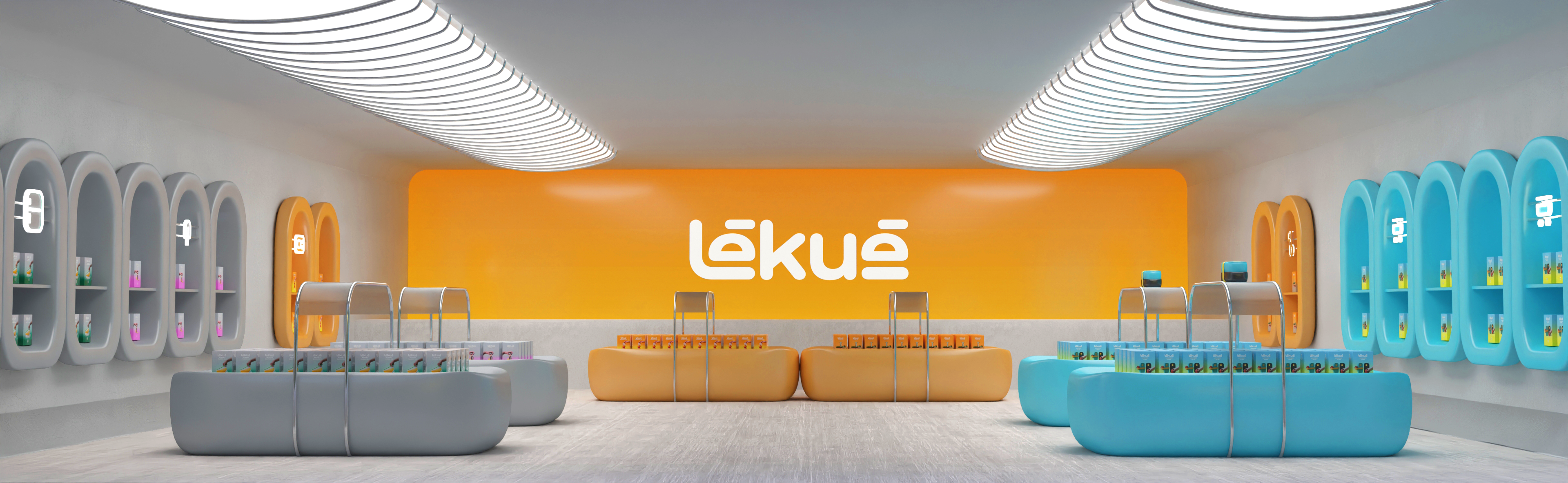
Lastly, we also imagined a flagship store for Lékué using the products themselves as inspiration for the store's furniture.
This project was done in a group, where I, Alberto Hidalgo, and Manel Pla participated.
VIDEO
Lastly, we also imagined a flagship store for Lékué using the products themselves as inspiration for the store's furniture.
This project was done in a group, where I, Alberto Hidalgo, and Manel Pla participated.
VIDEO